
A quarterly wellness report exists to let leaders make one decision: what to fix, fund, or expand before the next 90 days close. That decision depends on three numbers above all others: enrollment rate, engagement rate, and the direction of claims trends. If engagement drops in a specific department this quarter, the action is a targeted pilot next quarter, not a wait-and-see memo.
TL;DR:
- Engagement rates should increase within 30 days of targeted interventions, but claims improvements typically require a full year of consistent effort.
- Regularly verify data sources and update frequencies to ensure metrics are accurate, especially for claims and utilization data with inherent delays.
- Highlight only significant metric changes, such as a 5-point swing or a 10% claims increase, to maintain leader trust in the report's insights.
- Focus on specific leading indicators like engagement and participation to guide immediate actions, while viewing claims data as a long-term outcome.
- Integrate wellness KPIs into existing leadership scorecards with assigned owners and follow-up checkpoints, not as standalone reports.
Table of Contents
- Key Quarterly Metrics for Wellness Reporting
- Where the Data Comes From and How Often to Pull It
- Building a Dashboard Leaders Will Actually Read
- Reading the Signals: What Moves This Quarter, What Moves Next Year
- Getting Wellness Metrics Into Leadership Governance
- Hadaco's Approach to Quarterly Reporting and Savings Tracking
- What HR Should Realistically Expect Quarter to Quarter
- See Your Own Quarterly Savings Estimate
- Sources
Key Quarterly Metrics for Wellness Reporting
Every quarterly wellness report needs a small set of metrics that actually move decisions, not a data dump. SHRM's guidance on wellness program ROI points to enrollment, engagement, utilization, absenteeism, and claims as the core five. Here's how to define each one so quarter-over-quarter comparisons actually mean something.
- Enrollment and participation. Enrollment rate equals enrolled employees divided by eligible employees. Decide your denominator once (full-time only, or full-time plus benefits-eligible part-time) and never change it mid-year, or you'll compare apples to a different orchard entirely.
- Engagement metrics. Active users, session counts, and pulse-survey response rates tell you whether people are actually using what they signed up for. A high enrollment rate with comparatively low active engagement suggests a marketing problem rather than a health problem.
- Utilization of services. Track mental health visits, coaching touches, and preventive screening completions separately. Lumping them together hides which service is actually earning its budget.
- Absenteeism and presenteeism signals. Pull unplanned time-off rates from payroll and calculate them per FTE per quarter. This is often the fastest-moving indicator you have.
- Claims and cost trends. Use a rolling window, not a single quarter's slice, since claims data is noisy and lags behavioral change by months. Treat quarterly claims figures as directional, not conclusive.
Where the Data Comes From and How Often to Pull It
Getting these numbers right depends entirely on knowing where they live and how often you refresh them. Four systems feed a wellness report, and they update on different clocks.
- HRIS and payroll systems supply headcount, eligibility, and absenteeism data. Pull this monthly so your enrollment denominator never goes stale.
- Benefits vendor APIs feed engagement and utilization numbers. Vendor platform reporting often supplies this data automatically, which is why it's worth confirming your vendor's export cadence matches your reporting calendar.
- Claims data, whether from a third-party administrator or an adjudicated claims feed, arrives with a natural lag. Align your claims window a full quarter behind your other metrics so you're not comparing incomplete data to complete data.
- Pulse surveys and platform logs round out the qualitative side and should run monthly at minimum to catch shifts before they show up in claims.
Before publishing any report, reconcile your denominators, flag outliers (a department that suddenly shows 40% enrollment growth is probably a data entry issue, not a miracle), and check for membership changes from mergers or layoffs that would distort trend lines. Keep claims reporting high-level and aggregated. Anything approaching individual-level health data needs to stay de-identified and handled with basic HIPAA awareness in mind, even in an internal HR document.
Building a Dashboard Leaders Will Actually Read
An executive who opens a 40-page PDF will read the first page and nothing else. Design for that reality. The top of every quarterly wellness report should be a one-page snapshot: your top 3 KPIs shown against last quarter and the same quarter last year, followed by a single-sentence recommendation. Everything else supports that page.
- Executive snapshot: current quarter vs. prior quarter vs. same quarter last year, for enrollment, engagement, and claims trend.
- Supporting charts: an enrollment funnel showing drop-off from eligible to enrolled to active, an engagement heatmap by site or department, a rolling 12-month claims trend line, and absenteeism broken out by job family.
- Appendices: metric definitions, data source notes, methodology (especially how you're smoothing claims data), and raw tables for anyone who wants to audit the numbers.
Keep chart axes consistent across quarters so a reader can flip back three reports and immediately spot the trend line moving. Smooth genuinely noisy series, like weekly engagement or small-population claims, with a rolling average rather than plotting raw weekly spikes that mean nothing on their own.
Pro Tip: Highlight only the metrics that moved beyond a threshold you set in advance, like a 5-point swing in engagement or a 10% claims increase. If you highlight every wiggle in the data, leaders stop trusting the highlights.
Reading the Signals: What Moves This Quarter, What Moves Next Year
Enrollment and engagement are leading indicators. They shift within weeks of an intervention and tell you whether a program change is working before the money numbers catch up. Claims and absenteeism are lagging indicators. They reflect decisions and health events from months, sometimes a full year, earlier. Confusing the two is the single most common misread in wellness reporting.
Set expectations accordingly: engagement can move within one quarter of a targeted push, but meaningful claims cost improvement typically shows up in year two, not year one. Insurers and population health platforms tend to counsel patience here for good reason.
- Low engagement in a specific department: run a targeted pulse survey, test a small incentive, and remeasure engagement in 30 days rather than waiting for next quarter's full report.
- Localized utilization rise, say, a spike in mental health visits at one site: confirm it's not a data artifact, then check whether it's a positive sign (more people seeking help) or a stress signal worth investigating further.
- Claims uptick: resist the urge to react immediately. Check whether it's a single high-cost claimant skewing a small population before concluding the program isn't working.
Pro Tip: After any quarter-level intervention, measure the specific leading indicator you targeted, not overall claims. If you ran an engagement pilot, judge it on engagement movement, not on whether claims dropped that same quarter.
Getting Wellness Metrics Into Leadership Governance
A quarterly wellness report that lives in a shared drive and gets skimmed once accomplishes nothing. It needs a seat at the same table as finance metrics. Some organizations fold wellness KPIs directly into existing environmental and safety scorecards that leadership already reviews, which keeps the numbers visible and funded rather than optional.
- Present alongside CFO-relevant figures like claims per FTE and absentee days per employee, not as a standalone HR appendix.
- Assign a named owner for every recommended action and set a 30 or 60-day follow-up checkpoint, not just a "next quarter" checkpoint.
- Open the report with one sentence executives will actually read: what changed, why it matters financially, and what you're doing about it.
Hadaco's Approach to Quarterly Reporting and Savings Tracking
Hadaco builds its programs around this exact discipline. There's no upfront fee to start, and employers working with Hadaco have reported savings per employee in the first year, tracked and reported quarter by quarter rather than promised as a one-time projection.
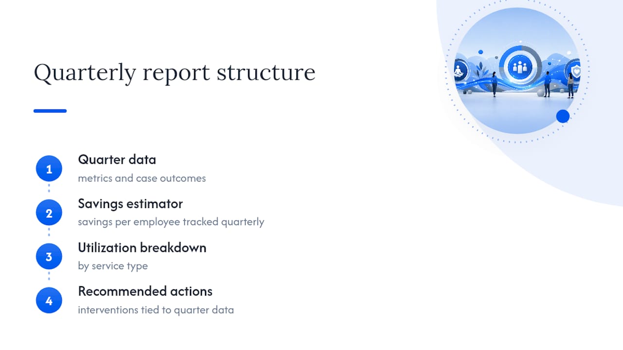
Hadaco's quarterly report format includes a savings estimator, a utilization breakdown by service type, and a short list of recommended interventions tied directly to that quarter's data, the same leading-indicator-to-action structure outlined above. Case outcomes and program specifics vary by employer population and current benefit design.
What HR Should Realistically Expect Quarter to Quarter
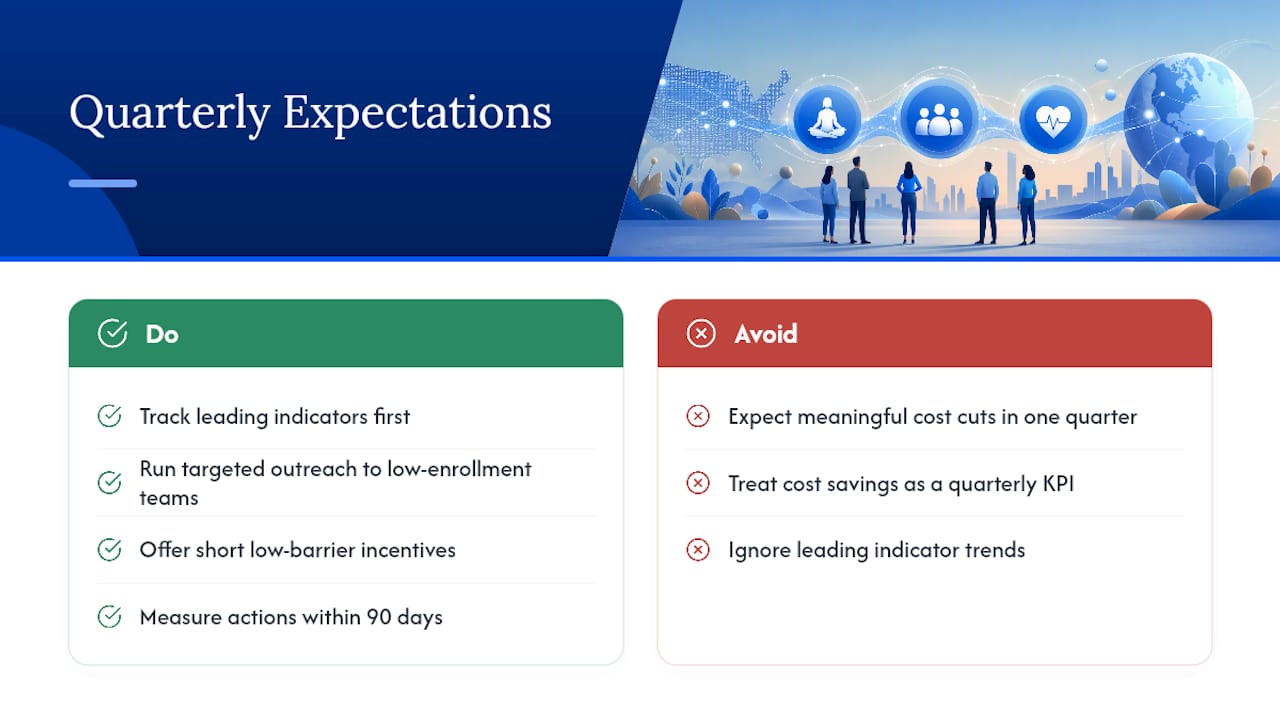
Meaningful healthcare cost reduction rarely shows up in a single quarter. It compounds over a year or two of consistent engagement, which is why leading indicators deserve more attention than most HR teams give them.
Two moves that reliably shift leading indicators within a single quarter: a targeted outreach campaign to a low-enrollment department, and a short, low-barrier incentive tied to one specific health action, like a biometric screening. Both are measurable in 90 days. Cost savings are not, and treating them as if they should be sets up every quarterly report to disappoint.
— Gene
See Your Own Quarterly Savings Estimate
Hadaco gives employers the reporting infrastructure this article just walked through, built in, with no upfront fee to get started. Instead of assembling dashboards from scratch across payroll, vendor feeds, and claims data, employers get a quarterly report with the savings estimator, utilization breakdown, and interventions already structured the way this article recommends. It layers onto your existing benefit plan rather than replacing it, so there's no disruption to what employees already have.
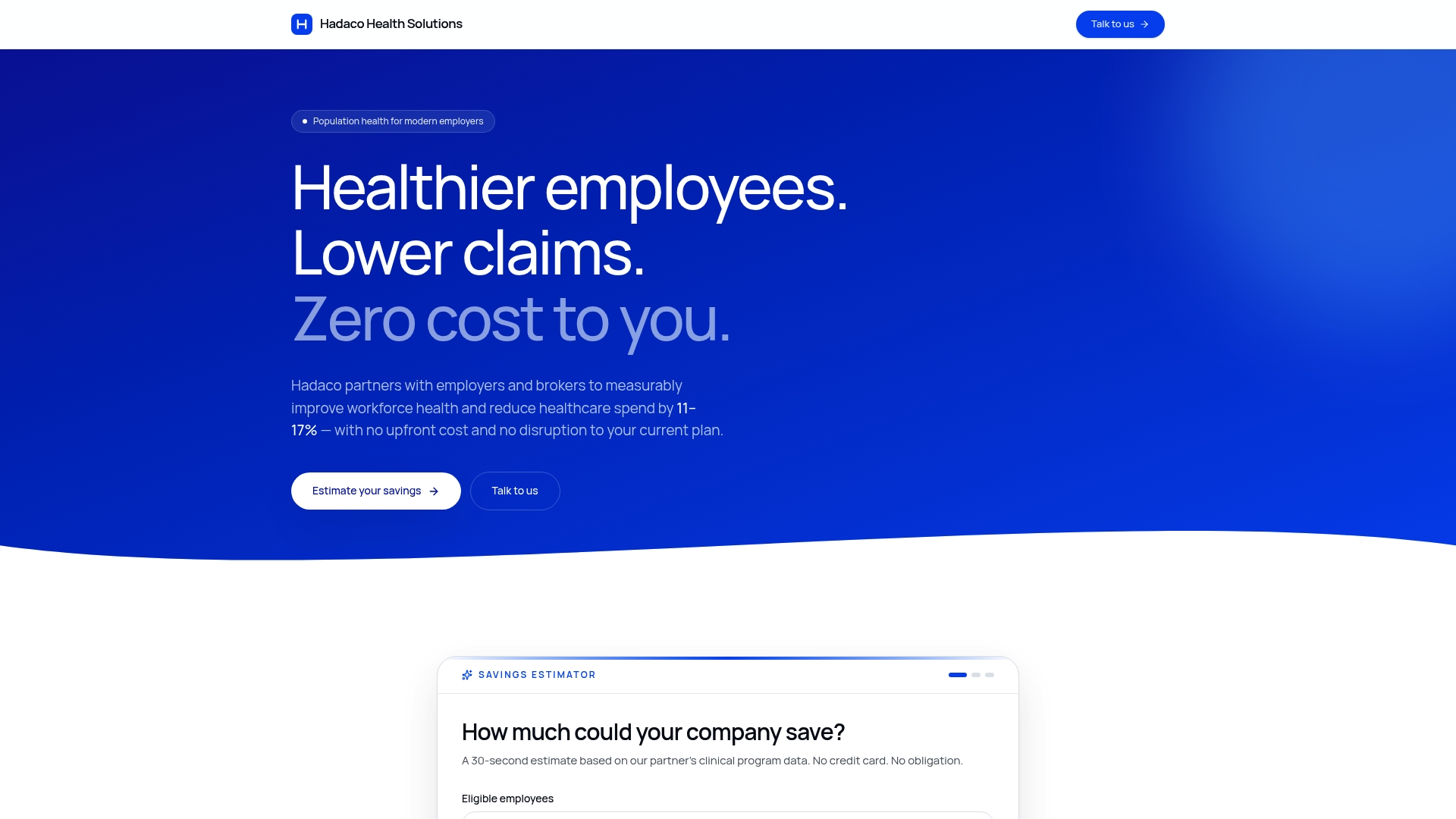
If you're ready to see what your own workforce's numbers could look like, run the Hadaco savings estimator and request a walkthrough of a sample quarterly report before your next benefits review cycle.
Sources
- SHRM: Wellness program ROI depends on design and implementation
- Maven Clinic: Employee wellness program metrics