
A wellness outcomes report has one job: prove that engagement translated into measurable health improvement and financial return, not just that people showed up. The report needs to move past attendance counts and into headline metrics that carry weight: sustained engagement rate, risk-score trend, clinical outcome shifts, and cost trend. Everything below shows how to build that case, quarter by quarter.
TL;DR:
- Sustained engagement rates should be high enough before expecting significant clinical improvements or cost savings.
- Reporting should include risk status shifts, utilization changes, and biometric trends over multiple quarters to support ROI claims.
- Clinically relevant data must combine biometric results with patient-reported outcomes and be analyzed at the cohort level only.
- Financial impact assessments require a clear value chain linking engagement to risk reduction, utilization, and claims cost.
- Use segmented, trend-focused dashboards with limited KPIs to enable leadership to identify progress and risks efficiently.
Table of Contents
- What Metrics Belong in Wellness Outcomes Reporting
- How to Structure Reporting: Cadence, Segmentation, and Dashboards
- Linking Participation to Outcomes and ROI
- Measuring Health Outcomes: Clinical Data and Patient-Reported Outcomes
- Presenting Wellness Outcomes to Leadership and Finance
- What Hadaco's Reporting Approach Adds
- Practical Perspective: Common Measurement Pitfalls
- How Hadaco Helps With Outcomes Reporting
- Sources
What Metrics Belong in Wellness Outcomes Reporting
Most wellness dashboards drown in activity data and starve for outcome data. That imbalance is the single biggest reason finance stops trusting these reports after year one.
Start by separating activated engagement (a one-time signup, a single biometric screening) from sustained engagement (repeat coaching sessions, ongoing app use, quarter-over-quarter participation). A moderate activation rate paired with a lower sustained engagement rate indicates the program has a retention problem, not a marketing problem. Sustained engagement should be strong enough before expecting plausible clinical movement.
The core metric categories any wellness outcomes report should cover:
- Clinical outcomes: blood pressure, HbA1c, LDL cholesterol, and BMI, tracked against a baseline cohort.
- Risk-status indices: the share of participants moving from high risk to moderate or low risk over 12 months.
- Utilization measures: ER visits, hospital admissions, and primary care follow-through rates for chronic conditions.
- Incentive performance: redemption rates by tier, and where in the funnel people stop engaging.
- Productivity proxies: absenteeism, presenteeism, and voluntary turnover among enrolled versus unenrolled employees.
A caveat worth stating plainly: productivity metrics get captured far less consistently than participation data, largely because absenteeism and presenteeism require payroll or HRIS integration that many HR teams haven't built yet. Flag that gap in your report rather than pretending the data is cleaner than it is.
How to Structure Reporting: Cadence, Segmentation, and Dashboards
Reporting cadence isn't a formatting choice. It changes what conclusions you're allowed to draw. Weekly reports are built for near-term operational feedback, like whether a new email campaign moved sign-ups. Monthly and quarterly reports carry the larger sample sizes needed for trend reliability, which is where clinical and cost claims actually hold up.
A workable cadence structure looks like this:
- Weekly: engagement counts, incentive redemptions, campaign response, by department.
- Monthly: risk-tier movement, utilization trend, absenteeism trend, rolled into a color-coded status.
- Quarterly: full outcomes package, biometric trend, financial translation, board-ready summary.
Segment every one of these by department, location, age band, and risk tier before you aggregate anything. Use a traffic-light status (on track, at risk, not on track) against a pre-set target threshold for each segment, not just the total population.
Pro Tip: Build one executive panel with five KPIs max, then let department heads drill into their own segment. Nobody in finance wants to scroll through 40 rows to find the number that matters.
For the dashboard itself, a trend line beats a bar chart for anything measured over multiple quarters, and a funnel chart works better than a table for incentive drop-off. If you need a deeper build guide, Hadaco's analytics walkthrough covers dashboard construction in more detail.
Linking Participation to Outcomes and ROI
This is where most reports fall apart. A claim like "we saved $1.2 million" without a value chain behind it invites the CFO's most dangerous question: how do you know it was the program?
The value chain runs in a specific order: engagement leads to behavior change, behavior change leads to risk reduction, risk reduction leads to utilization shifts, and utilization shifts eventually show up in claims cost. Report each link, not just the final number.
Plausibility metrics that support this chain include:
- Initial engagement rate and sustained engagement rate over 12 months.
- Percentage of at-risk participants who moved down a risk tier.
- Change in ER visits or inpatient admissions among engaged versus non-engaged employees.
- Direction and size of the biometric shifts feeding into risk scores.
The HERO/PHA metrics guide outlines five accepted methodologies for monetizing claims savings, ranging from simple trend comparison to adjusted expected-versus-actual modeling, and recommends pairing whichever one you choose with the plausibility metrics above. Participant-versus-nonparticipant trend comparisons are the fastest to run; adjusted expected-versus-actual models take longer but hold up better under scrutiny. Give either method 12 to 24 months before drawing a firm savings conclusion. A scoping review of workplace wellness economic evaluations found that programs with disease-management components and longer follow-up periods tend to show stronger ROI, while the more rigorous studies often report more conservative numbers. Set expectations accordingly rather than promising a specific multiple upfront.
Measuring Health Outcomes: Clinical Data and Patient-Reported Outcomes
Biometric screenings alone miss half the picture. A participant's HbA1c might hold steady while their day-to-day functioning and stress load get dramatically better, or worse. That's why FDA guidance recommends pairing patient-reported outcomes with clinical measures rather than relying on lab values in isolation.
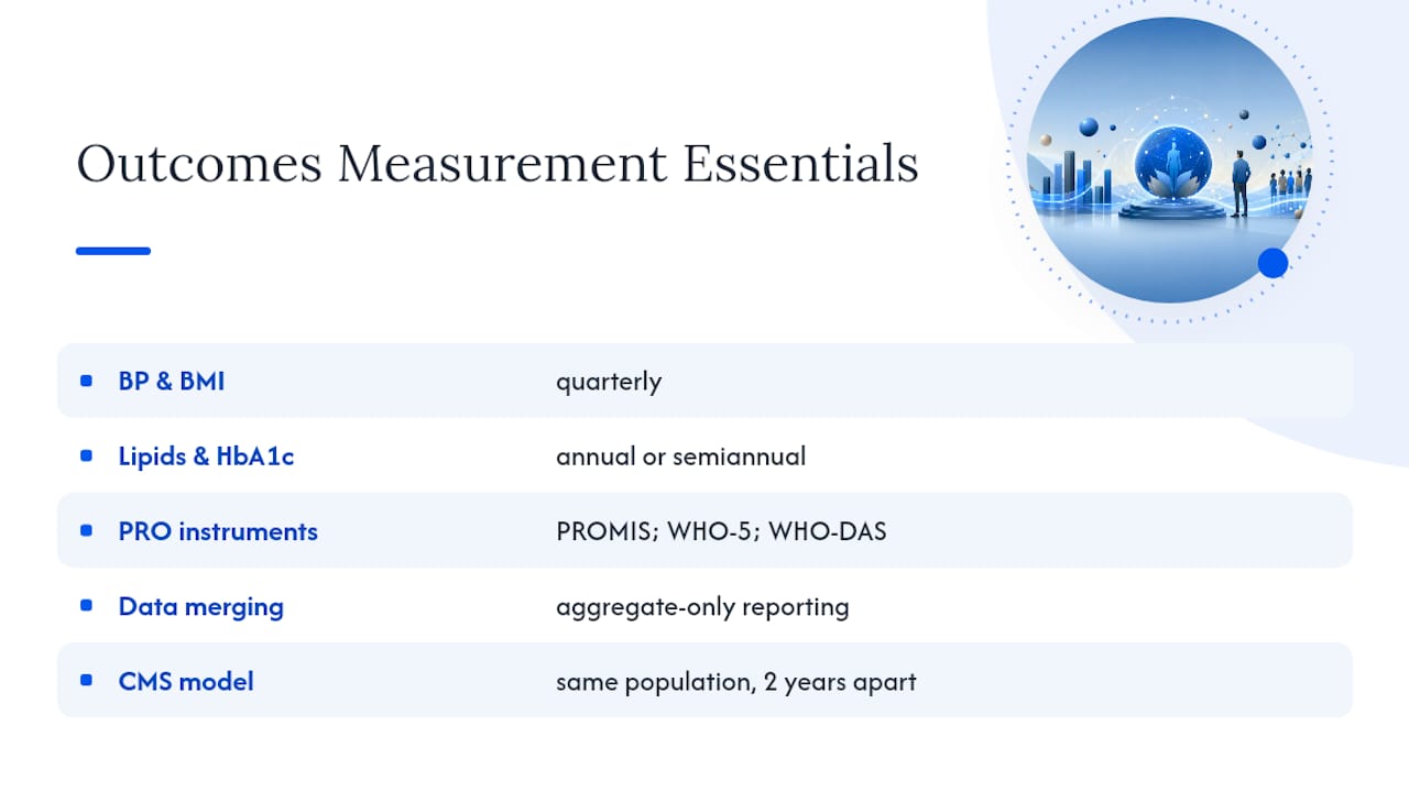
For clinical measures, collect blood pressure and BMI quarterly, and lipid panels and HbA1c annually or semiannually depending on risk tier. For PROs, validated instruments like PROMIS, the WHO-5 wellbeing index, and WHO-DAS give you a standardized way to track functioning and mental health without inventing your own survey.
Merging PRO data with claims and biometric data has to happen at the aggregate level, never at the individual level in any report leadership sees. CMS's own Health Outcomes Survey uses this longitudinal model, surveying the same population two years apart to detect real change rather than noise. Apply the same patience to your own program before calling a shift meaningful.
Presenting Wellness Outcomes to Leadership and Finance
Finance doesn't want the biometric detail. They want three numbers: the health care trend rate, the estimated presenteeism recovery, and the turnover savings tied to retention among engaged employees.
The translation finance actually reads starts with a simple calculation: take the hourly cost of lost productivity, multiply by estimated hours recovered per engaged employee, then scale by headcount.
- Lead with value on investment (VOI), not just ROI, since VOI captures retention and morale that ROI ignores.
- Expect 12 to 24 months before cost trend moves meaningfully.
- Format as a one-page executive summary with a technical appendix behind it.
Pro Tip: If your CFO has ever asked "compared to what?" after a savings claim, that's your signal to add a nonparticipant comparison group to next quarter's report. For a deeper breakdown of ROI language executives expect, see Hadaco's ROI guide for HR leaders.
What Hadaco's Reporting Approach Adds
Hadaco builds its programs around the same plausibility logic outlined above rather than a generic wellness dashboard. The programs integrate with existing benefit plans instead of replacing them, and every claim runs through:
- A transparent savings estimator employers can review before committing.
- Quarterly outcomes reporting tied to engagement, risk trend, and cost trend.
- No upfront fees, with pricing linked to demonstrated results.
- An average first-year savings of $451 per employee among companies using the model.
[Case-study details and author credentials to be inserted here.]
Practical Perspective: Common Measurement Pitfalls
The mistake I see most often is treating participation as the finish line instead of step one in a chain. Skip vanity metrics. Segment before you summarize, always. Build a checklist: data source, baseline, target, confidence interval. Report against that, not against hope.
— Gene
How Hadaco Helps With Outcomes Reporting
Hadaco gives you the reporting infrastructure this article just walked through, built into the program itself rather than bolted on afterward. That means a savings estimator you can run before signing anything, quarterly outcomes reports that track the same plausibility chain, engagement, risk trend, utilization, cost, and no upfront fee structure that puts the financial risk on results instead of on your budget.
The programs layer onto whatever benefits you already offer, so there's no disruption to existing plans and no separate vendor relationship for your broker to untangle. If your current wellness reporting can't answer "did this actually move the needle," that's worth fixing before another budget cycle passes. Run the savings estimator and see what a plausibility-based report would look like for your own population.
Sources
- FDA: Patient-reported outcomes and other clinical outcome assessments
- Periodic reporting for wellness programs (PMC)
- CMS: Health Outcomes Survey (HOS)